There are 4.5% of you who are here on this site who I think should leave right now. You’re not welcome here. To be sure you’re not part of that 4.5%, let’s do a test. Can you tell which of the following is the red rectangle and which is the green rectangle? If yes, you may proceed to read the rest of the article.

OK, we’re all sorted out now? Great. Let’s continue…
Go Away. We Don’t Need Your Money.
“You’re not welcome here” is what we designers are saying when critical features on our websites are displayed via differences in color only. We’re telling the 4.5% of the population of the Earth who are colorblind that we do not want them using our website. We do not want them buying things on our website. We do not want them reading the information we have to share with the world.
We’ve all been guilty of not designing websites for the colorblind at times, including me. I cannot proclaim complete innocence on this point. Colorblindness is not something that we traditionally think as a disability. We might make sure that our site is usable with screen readers and our keyboard-only access is working great. But still there are some people that we’re leaving out when we don’t create designs for people who can’t perceive color like most do. This is about 8% percent of males and 0.5% percent of females on the planet. Over 300 million people.
Designing Maps, Charts and Graphs for the Colorblind: London’s got the right idea
Roma, ![]() “Ti amo,” but it looks like you are one of those places that does not want colorblind people using your subway. I’m sorry to have to pick on you because I love you dearly and want to retire there someday, but the map you provide on your metro’s website speaks for itself. With some forms of color blindness, you can’t tell one subway line from the other.
“Ti amo,” but it looks like you are one of those places that does not want colorblind people using your subway. I’m sorry to have to pick on you because I love you dearly and want to retire there someday, but the map you provide on your metro’s website speaks for itself. With some forms of color blindness, you can’t tell one subway line from the other.
Full-Color View of Rome Metro Map
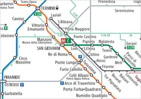
How a colorblind person views the Rome Metro Map
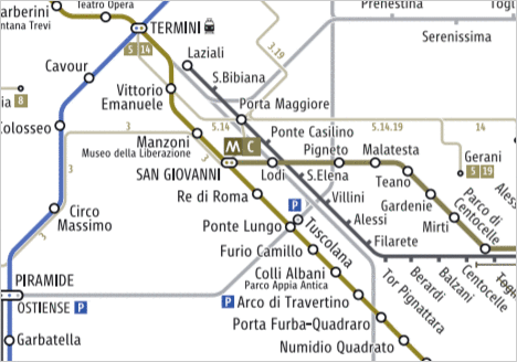
Rome subway map online (from Metro Roma), standard version and version as seen by a person with protanopia (a type of red-green colorblindness). It’s hard to distinguish the orange line from the green one because the differences are based only on color.
London, on the other hand, makes a great effort at welcoming the colorblind, because look at this map! Their standard map on their site has the same color-dependent problem as Rome’s. But they have another black and white version for download on their site. On that version, the differences are based on factors other than color. With or without color, the alternative London map is still readable. Notice how they’ve added textures to the various lines to differentiate them.
London Metro Map – Full Color View
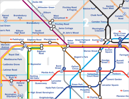
How a colorblind person views the London Metro Map
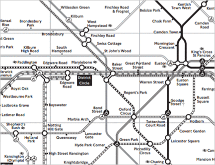
London subway map: standard and black and white version. Train lines can be differentiated from one another without color due to the different textures on each line. (from https://tfl.gov.uk/maps/track/tube)
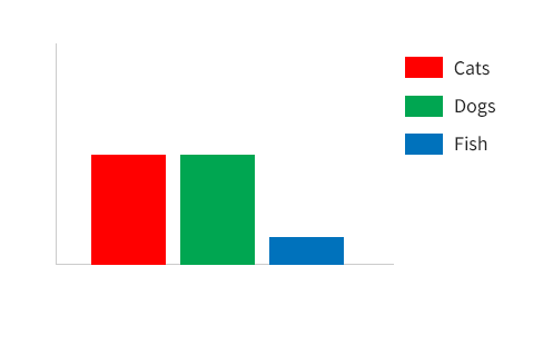
If you design charts and graphs on your website or software, then you need to be careful of similar issues. A bar chart like the following can be difficult for some people to use. The colors on the bars correspond to colors in the legend. Certain colors can be difficult to differentiate for some common types of color blindness. Therefore, in this case here, good color vision is needed in order to know which bar is which.
Bar Chart – Full-color View
Bar Chart – Colorblind View
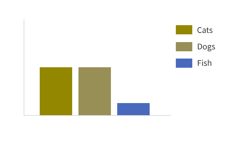
Bar charts which depend only on color can be hard to understand when the color cannot be perceived properly.
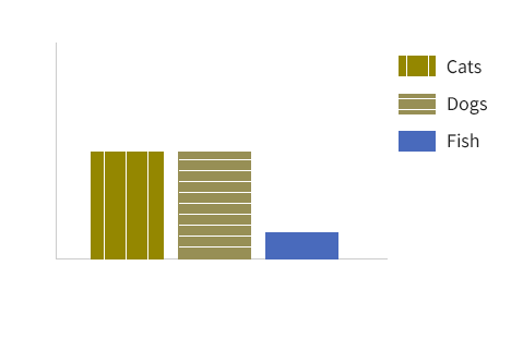
This chart could be fixed in many ways. Two of the options include
- Adding different textures to the different bars
- Labeling each bar directly rather than having a separate legend
Accessible Bar Chart – Adding Textures
Accessible Bar Chart – Labels
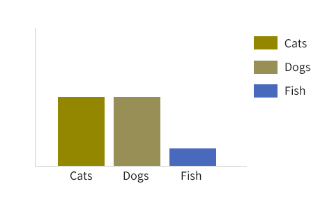
Designing better options for the colorblind on your websites: these bar chart designs don’t depend on color to be understood.
These two fixes for the bar chart and the black-and-white London map have one thing in common. The design doesn’t depend on color alone to convey the information. There are additional differentiators, so color is a bonus, not a requirement.
Shopping Online with Color Blindness: Finding a Red Sweater is Hard Work

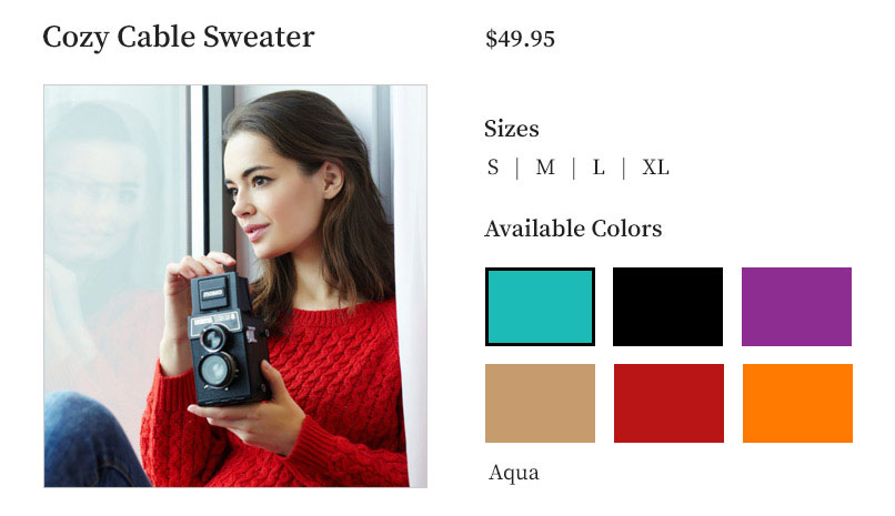
Mike wants to buy a red sweater for his lovely Marie’s birthday. He goes to her favorite online store and finds a sweater that’s perfect for her. He picks a size and looks at the colors available. What he sees is a bunch of swatches of unlabeled colors. Many swatches look the same to him because he has a form of red-green color blindness.
Unlabeled color swatches – full-color view
Unlabeled color swatches – colorblind view
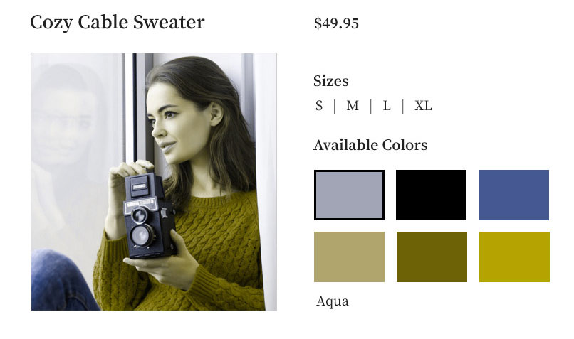
Challenges for colorblind people when swatches are unlabeled — the colors are not recognizable
He knows he’ll be in trouble if he gets orange because Marie says “orange washes me out” (whatever that means).
He hovers over each swatch, but there is nothing that pops up saying the name of the color. So he starts clicking on swatches one at a time in case the name of the color will pop up somewhere. He’s in luck. The names do show up. He sees “Aqua” then “Black” — and that’s where his luck ends. The next swatches have names like “Aubergine,” “Palomino,” and “Jubilee.” Not helpful.
So, he opens a new tab and starts to google the names (“what in the world is Aubergine…oh, it’s purple…why didn’t they just call it purple?”).
At the end of his research, he still doesn’t know if this sweater even comes in red.
He decides to go ahead and put a “Spice”-colored sweater in his cart. “Spicy hot, red-hot…so Spice could be red, right? I have to get back to work. Let’s just go with that.”
There are several areas of this shopping experience which could have been better. Designing better websites for the colorblind means:
- Label the swatches. Mike shouldn’t have to “guess and check” by clicking on each one
- If the swatches weren’t labeled, having the color show on hover would have helped Mike
- This isn’t the website designer’s fault, but seriously: “Palomino”? “Jubilee”? (These are actual clothing color names from a site I was on last night.) This is an example of where product designers could do a better job with the customer experience. Those color names make sense to no one.
Designing Forms for the Colorblind? Wasting Mike’s Time, Part 2
Mike goes to the checkout and enters his shipping information. He apparently makes a mistake somewhere because when he hits the purchase button, an error appears. “Please fix the fields marked in red.” Well, that’s not going to be easy because all of the fields look the same to him. There are no other error messages on the form. So he has to carefully check each field to see which ones might have problematic data in them.
Form With Error – Full-color View

Form with Error – Colorblind View

He saw that he left his name blank, so he resubmits. Again he gets the error message. For the life of him, he can’t see what he did wrong. It takes careful scrutiny to notice that he was missing the “.com” in his email address.
How could the designer of this form have made Mike’s life easier? Options for designing better forms and websites for the colorblind:
- First, if a field is required, label it as such
- You can say “Fix the fields marked in red” only if there is a secondary way to show the error. For example, show a message at the top of the form or show a message near the field.
Accessible Errors – Message at Top of Form

Accessible Errors – Message Near Field

Just like with maps and charts, designing forms for the colorblind on websites means not designing with a dependence on color.
By the way: Spice (which is another actual color name I saw on an online store) is…drum roll please…orange. The red sweater was: Jubilee. Obviously. Hopefully, the store has a good return policy.
Keeping our Colorblind Friends in Mind While Designing Websites
There are several types of color blindness. Although red-green color blindness is the most common, you can’t assume that everybody is red-green colorblind. There’s blue-yellow color blindness and even a type where literally they can see no color at all.
There are many things you need to keep in mind to make your UI and your website accessible to colorblind people. Sometimes I view screens in grayscale. That gets rid of any color dependence. There are some good colorblind simulators online such as Coblis Color Blindness Simulator. There’s one in Photoshop as well (go to View, then Proof Setup). These tools will allow you to see what your website looks like to colorblind people.
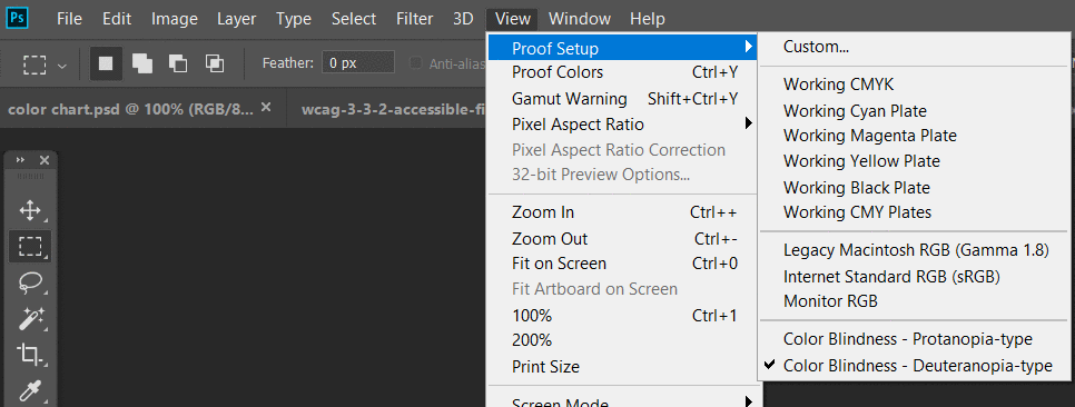
In Photoshop you can simulate some forms of color blindness to help with designing websites for the colorblind
While this is a great thing to do, this is not a foolproof method. There are many types of color blindness and you don’t know which type your visitor is going to have.
What you really have to remember, as the heading of this section says, is: don’t design based on color alone. It is a simple as that. Give additional messaging, show different textures on different parts of a chart, and so on. You can differentiate based on color…but you need a second indicator to go along with the color differences. Do this to minimize the chance that you’ll be leaving your colorblind customers out.
WCAG 1.4.1: Don’t Design Based on Color Alone
WCAG 1.4.1 Use of Color is the WCAG success criterion which says that you cannot use color alone for designing and developing your UI. You can check that out, or if you’d like some visuals, consider our Accessibility for Designers course. It gives real-life examples of inaccessible color choices and demonstrates how to fix them.
Don’t design based on color alone
At the beginning of this post I obviously didn’t mean it when I said that I don’t want colorblind people on my site. That is the message that we’re sending, however, when we make the design choices discussed here.
Maybe we’re hoping that they will just figure it out somehow. Maybe we don’t think of them at all. I don’t know what the deal is in your case. Sometimes admittedly I haven’t been designing websites for the colorblind in the past. I didn’t realize how common color blindness was, and I didn’t know the effect these color-dependent designs have on usability. I’ve learned my lesson.
Designing Websites for the Colorblind: Let’s Get Better at This Together
By the way, I know quite a few colorblind people. My neighbor is one of them. I don’t actually know which neighbor, but I live in a crowded neighborhood. With 4 out of 100 being colorblind, at least one of these neighbors has got to be, right?
People like my neighbor and Mike live in a world where a stop sign blends into the green leaves behind it, and they can’t see which bananas are ripe. They don’t need additional difficulties when trying to buy a birthday gift online. Unlike the issue with the bananas, the online difficulty could have been avoided with different design decisions.
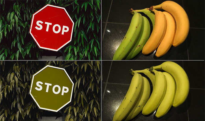
Colorblind people are everywhere. You probably know several colorblind people, unless you simply don’t know many people. Just because these acquaintances haven’t outed themselves as colorblind doesn’t mean we can pretend colorblindness doesn’t exist.
Can we try to keep them in mind? Designing websites for the colorblind: let’s all get better at this together.
