I think that we can all agree that if the general usability of a site is not great, it’s going to be hard to use for people with and without disabilities.
I understand that it can be difficult to navigate the accessibility rules, especially if you’re new to the topic. A lot of designers are struggling with this. I have found that when fixing a site’s general usability you automatically end up fixing some of the accessibility problems. You are probably pretty familiar with examining the usability of your sites — so why not start there?
In today’s post I’m going to show a few of the major common usability issues that I’m seeing across the web. I will give you suggested fixes, and you will learn from these examples how to make your site more accessible at the same time.
Insufficient Color Contrast: Making Things Harder Than They Need To Be
Examples of Color Contrast Issues
Lately I’m seeing a lot of white text on brightly colored buttons. These buttons are pretty and they catch people’s eyes. But some of the buttons have a low color contrast against the white text. They can be difficult to read, even for people with perfect vision.
![]()
Buttons which have very low color contrast between the white text and the button background
Here are some examples where the low color contrast is particularly problematic for any user:
- Someone is outside, the sun is shining, and they’re having trouble seeing anything on their screen, let alone these low color contrast buttons.
- Maybe it’s dark outside so they’ve set their screen brightness a little lower than normal. In this case, the lower contrast text also becomes harder for them to read.
- Someone can have trouble reading text that is low contrast if they’re not sitting close enough to their laptop screen or if they are viewing their screen at a weird angle.

Glare on a screen when outside in the bright sun can make text more difficult to read than usual.
Low-contrast buttons can be difficult for a user with good vision. So many people with vision impairments may not be able to read the text on the buttons at all. To those users, the buttons could appear to be just big pretty-colored rectangles.
In any case, these buttons will not pass accessibility requirements.
I understand the reason behind the color choices on the buttons. For a person with good vision in ideal lighting conditions, it can look nice and the cheery colors can sometimes convert better.
I’m sure that the designers who designed this were not thinking “I hope that some people can’t read this” as if they were conveying a secret message. But this is how some users will experience it.
But what I don’t fully understand, if I’m being honest, is the trend of low contrast as an art form like in the following examples.


Text with extremely low color contrast — it just seems unnecessary. From maybelline.com and kkwbeauty.com
I’m sure that the designers who designed this were not thinking “I hope that some people can’t read this” as if they were conveying a secret message. But this is how some users will experience it.
Same as for the buttons, these extremely low-contrast examples can be difficult for a user with good vision. They are going to be difficult or impossible to read for a low-vision person. These examples are nowhere close to accessible.
It’s not just low-contrast text that’s a general usability issue: icons which have low contrast can get overlooked easily because they don’t jump out as much. The user could also think that they might be inactive elements.
I often see the contrast issues with icons in online software. They get lost against the background color because they blend in too much. After using a piece of software over a period of time, one day I was surprised to learn that it had Notes and Export features that I had not noticed before. The icon color was too subtle!
![]()
If I want to configure the settings on what I’m seeing in the 401k widget, where do I do that? Even though there’s only one icon here, it really gets lost against the other bold colors. Also, it is inactive? By the way, despite what we designers like to tell each other, I’ve found via extensive usability and beta testing most users are not yet familiar with the “…” icon so they tend to look right past it. That fact makes a low color contrast version of this icon even more likely to be missed.
Also, it is nearly impossible at times to see focus indicators on some sites as I tab around the page. I don’t often use my keyboard to navigate, but when I do, focus indicators can be hard to see.
Low-contrast focus indicator on link

Low-contrast focus indicator on button

In the first shot the indicator on the Log In text is very faint. But I can see it. When I tab to the button, however, I very literally cannot see it at all unless I look really hard. From mint.com.
If you perform a usability test with users with perfect vision, do they occasionally miss icons, images, and focus indicators with low contrast? They might say: “Oh! I didn’t even see that print button!” I’ll admit it — I’ve heard it. Oops.
If perfect-vision users are having trouble, then someone with low vision is having an even harder time. Also, what about people who are colorblind? Can they see the focus indicator on every active component of your UI?
These low-contrast UI components also would not pass accessibility validation.
Optimize the Usability: Increase the Contrast
The solution is pretty self-explanatory. But just because it’s obvious doesn’t always make it a simple task.
Cases like this one with the very dark gray text on a black background are easy to fix. Make the gray lighter. No problem.

Lighten up the grays on this almost-black background
Situations like the cute bright buttons are harder. If I were to make this light orange login button darker I would end up with not-so-cute brown. I’m betting that the brown isn’t part of the color palette.
![]()
Original low color contrast orange button and the higher contrast brown button
The best way to resolve the contrast issue will depend on what your exact situation is. Here are a couple of ideas you could try:
- Use a different color in your palette for the button and use that orange as an accent color elsewhere
- Try dark text on the button instead of white
You’ll have to get creative to figure out how to resolve this for your site. Good thing you’re a creative professional!
You might say, “OK, this is all good, but I’m on this blog to read about accessibility. Exactly how much contrast do I need?” This is where we need to take a look at the WCAG accessibility guidelines.
How to Make Color Contrast Accessible: WCAG 1.4.3 and 1.4.11
In order to be “accessible,” you will need to meet minimum color contrast requirements for
- text
- some types of images
- all user interface components
WCAG (the Web Content Accessibility Guidelines) give guidelines for how to design your UI so that people with disabilities can use it. There are numbered Success Criteria which each tackle a different accessibility issue.
WCAG Success Criterion 1.4.3 is about text contrast. If the text does not meet the minimum color contrast required then it means that is probably hard or even impossible for anybody with low vision to read the text. WCAG 1.4.11 covers the minimum contrast requirements for non-text items such as focus indicators and icons.
If you meet the minimum contrast requirements then the user will get a double benefit:
- Improved overall usability by having text, icons, etc. which are easier to see for all users
- Increased accessibility for users with low vision
For specific contrast values: in a nutshell,
- Text contrast: if you’re shooting for AA you want 4.5:1, for AAA you want 7:1
- Non-text contrast (UI elements like buttons, icons, etc.) you want 3:1
Peek-a-boo! Fields with Disappearing or Missing Labels
How These Lack of Labels Are Causing Trouble for All Users
Many fields don’t have “traditional” labels. It’s now fashionable to have fields with placeholder text inside the field playing the part of labels which disappears when you type into the field. Also, this placeholder text often has low color contrast, which is makes it hard to read as discussed in the previous section.
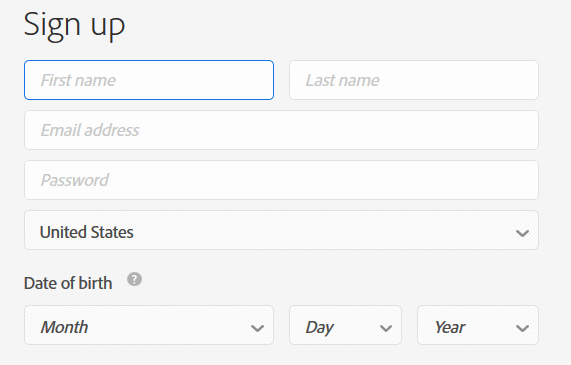
Signup form on Adobe.com. Placeholder text appears instead of labels and the placeholder text has very low color contrast
Sometimes labels are missing altogether. Apparently the designer felt that the context was clear enough in those missing-label situations.
I don’t believe I’m going too far out on a limb saying that fields which don’t have labels are difficult to use. Because of the disappearing placeholder text, I often have issues remembering what the field label was after I started typing. Was it asking for my city or postal code? I didn’t notice, so I have to delete what I typed and — crossing my fingers — hope that the label pops back into place. Sometimes it doesn’t, which forces me to reload the page — not an ideal user experience, especially if I filled out half of the form already.
What’s even worse is after you fill out an entire page full of these fields you start to get paranoid. You think “did I enter the phone number and the email in the right spots?” There’s no way to know what these fields without labels were for.
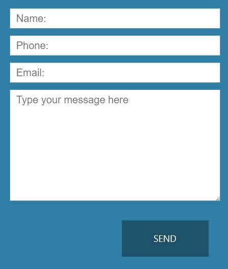
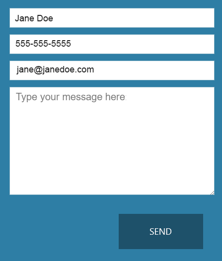
Placeholder text instead of labels. Once I’ve entered my information into the text fields, I can’t check to see if I entered the phone and email into the correct fields.
Some fields put the required formatting as the placeholder text. Is the field for birthdate looking for mm-dd-yyyy or yyyy-dd-mm? I couldn’t tell once I started typing. It makes things…challenging.
These labeling practices make sites less usable. They also make them not accessible. I don’t have cognitive or memory issues. Site visitors with these impairments can have a serious problem with these disappearing labels. Guessing the purpose of the field when there was never a label to begin with is also tough for any user.
Optimize the Usability: Use Proper Form Labels Instead of Placeholders
Do the following things to improve everyone’s experience:
- Don’t count on placeholder labels to take the place of proper form labels
- Put your form labels to the left or top of your fields because that’s where your users expect to find them
- Don’t put instructions like a date format inside the field as placeholder text — make it always visible (I will talk about this more in the next section)
How to Make Labels Accessible: WCAG 3.3.2
WCAG 3.3.2 (“Labels or Instructions”) discusses how to label your fields clearly and where to place those field labels.
One more note on this topic: a new technique I’m seeing now is having the label inside the field. Then once you enter the field the label pops upward and remains visible. I’m not 100% convinced that this technique is always accessible. It could be OK if coded correctly, but you will need to be careful to be sure it’s coded in an accessible manner. See Google Material Design documentation for more information.
What Format Am I Supposed to Enter Here for This Date?
Let the User Know if a Form Field Requires a Specific Format
There are some form fields that require a certain field format (such as birthdate: mm-dd-yyyy). Others need a minimum number of characters in them. The problem is that there is no hint to tell you this until you submit the form and get an error message. We all love when this happens, right?
(I’m getting a bit frustrated just thinking about it…maybe because this happened to me earlier today.) Sometimes I change my password and hit submit. Afterwards, I am informed that I needed to enter at least 8 characters. And a capital letter. And a number. Plus a special character such as !@#$%&*. This would have been better to know before I submitted the form.
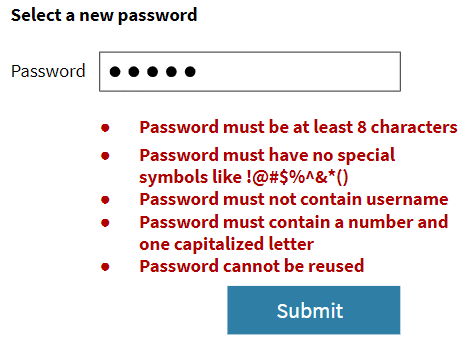
The new password field had specific requirements, but it didn’t tell me this in advance.
I’m a little annoyed when this happens. A better user experience would have been to tell me up front about the required field format.
But imagine you are blind and you need to do the following:
- Figure out why there was an error
- Find in which field the error happened
- Navigate to that field
- Fill out the field
- Navigate to the submit button
- Resubmit the form
That extra work could have been avoided with a proper hint text. This would be more than just an “annoyance” for those users. Again, this is not accessible.
This also affects people with severe mobility impairments. After seeing the error message they would have had to:
- Maneuver using the sip-and-puff straw in their mouth to return to the error field
- Fill out the form field
- Navigate back to the submit button
- Resubmit the form
Fixing this usability issue up front is an obvious win for everybody, disabled user or not.
Another related issue: sometimes errors fall off-screen. I sit, I look at the screen, the form doesn’t submit, and I see no error. I’m confused for a second or two before I scroll down and see the error way down below.
If those of us without cognitive disabilities are wondering why in the world the form didn’t submit, people with cognitive disabilities could get really lost and give up.
Optimize the Usability: Give the User Formatting Instructions and Fix Error Messaging
To address the “guess what kind of input we’re looking for in this field” situation, you need to write the required format out on the page. Some places where this can go are
- At the top of the form
- Near the field (under it, to the right of it)
- As part of the field label (for something short like a date format)
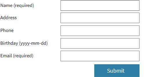
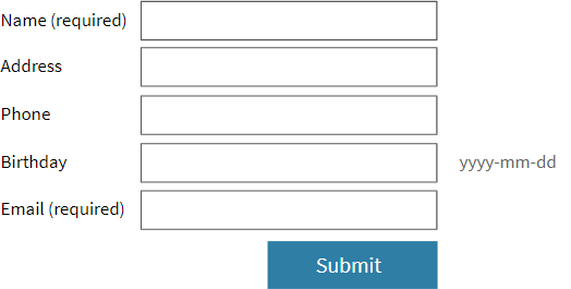
Here are a couple of different ways you could show which format you’re expecting the user to enter for a date field.
To help the user find errors that are hard to find, a couple of techniques are:
- Put a general error message up at the top saying that there are errors below that need to be fixed
- You could use a popup alert message to say there’s an error
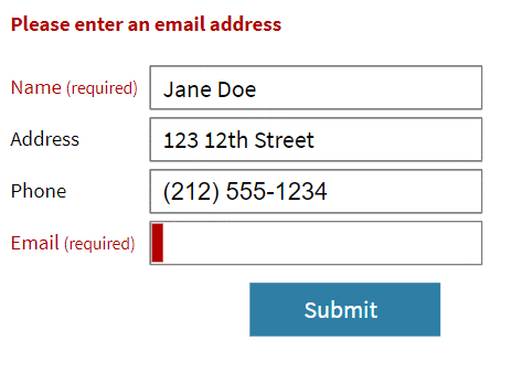
You can show a message at the top of the form. This is especially going to be helpful if it’s a long form.
Fixing this usability issue also moves your form towards being more accessible.
How to make these errors more accessible: WCAG 3.3.1 and 3.3.2
For the field format instructions, check out WCAG 3.3.2 (“Labels or Instructions”). It gives multiple ideas where to place these helpful form field hints.
To make sure the user can find the error easily, there is WCAG 3.3.1 (“Error Identification”). Among other things it discusses, it advises how to show errors so people of any disability can find those errors and fix them.
There are many factors that go into making forms more usable and accessible. We have several modules in our design course where we go into detail and we will give you lots of visual examples.
Let’s Make the Web More Usable
More usable sites are big wins for every single user. If a non-disabled user can’t use parts of a site, then disabled users will also have difficulties.
If you’re just starting out learning about accessibility, it might be much easier for you to think about general usability first. Using this strategy will make learning about web accessibility less overwhelming. So go ahead and first concentrate on general usability best practices. Then add in the accessibility requirements as you develop your design.
If it’s not usable, then it’s almost certainly not going to be accessible anyway. Kill two birds with one stone and focus on the usability first.
Leave a note in the comments if you have any questions. If you found this post helpful, please share.
